
Project Notes: Andrew Sage
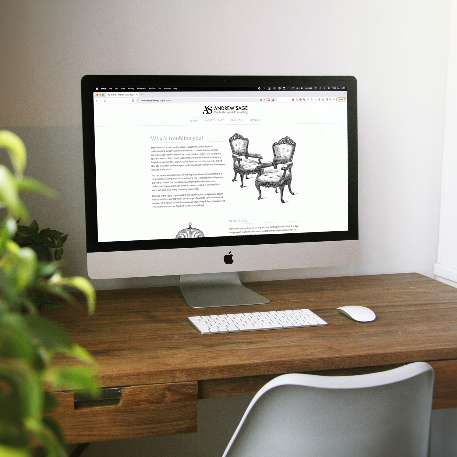
Andrew Sage is a skilled physiotherapist operating in both London and Manchester. Driven by a passion for psychotherapy, Andrew focuses on helping individuals achieve real and lasting transformation. With extensive professional experience, he has found the psychodynamic approach to be especially effective in uncovering the core issues troubling his clients, paving the way for sustainable, long-term change.
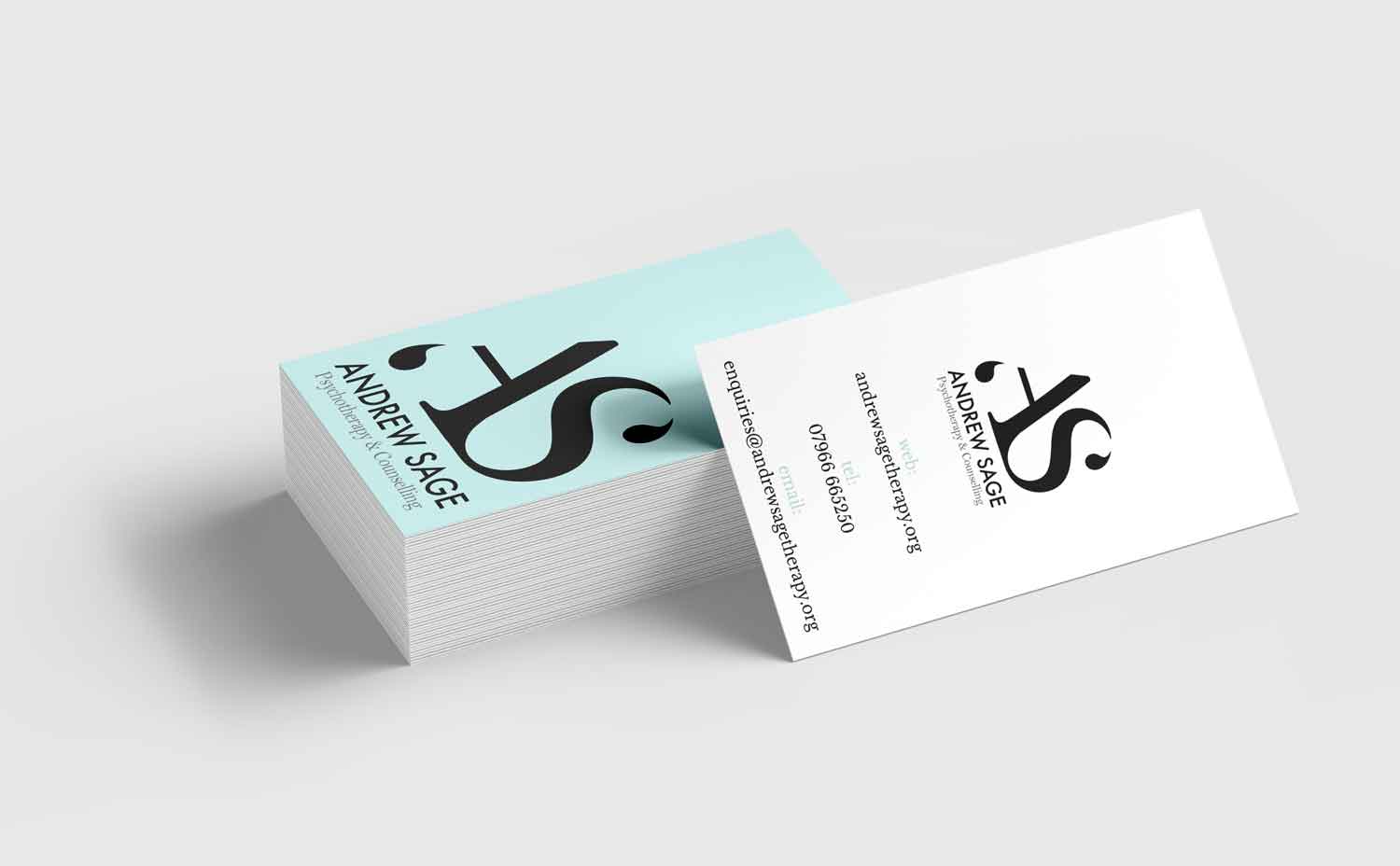
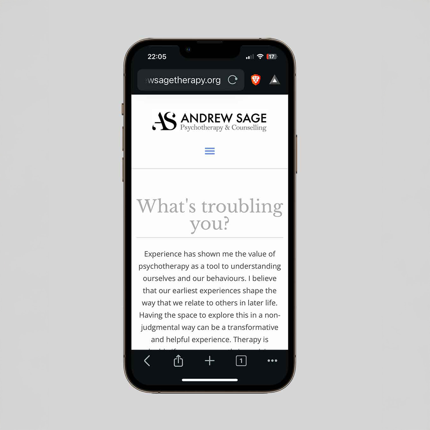
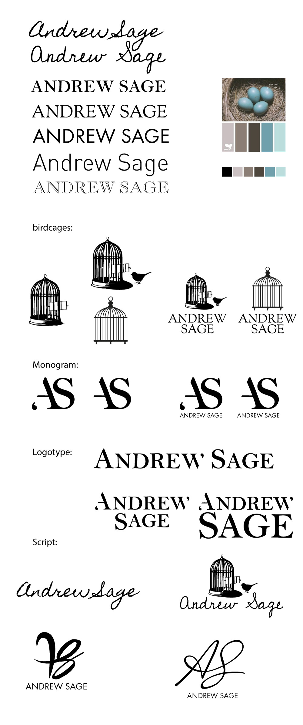
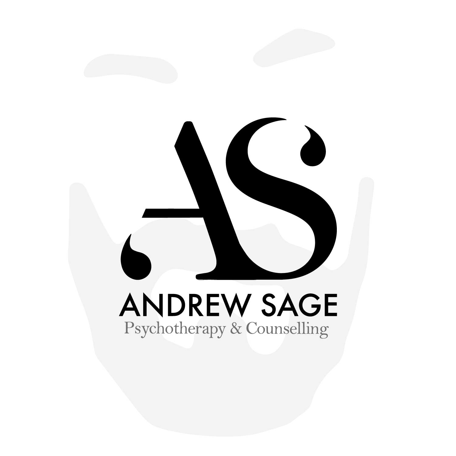
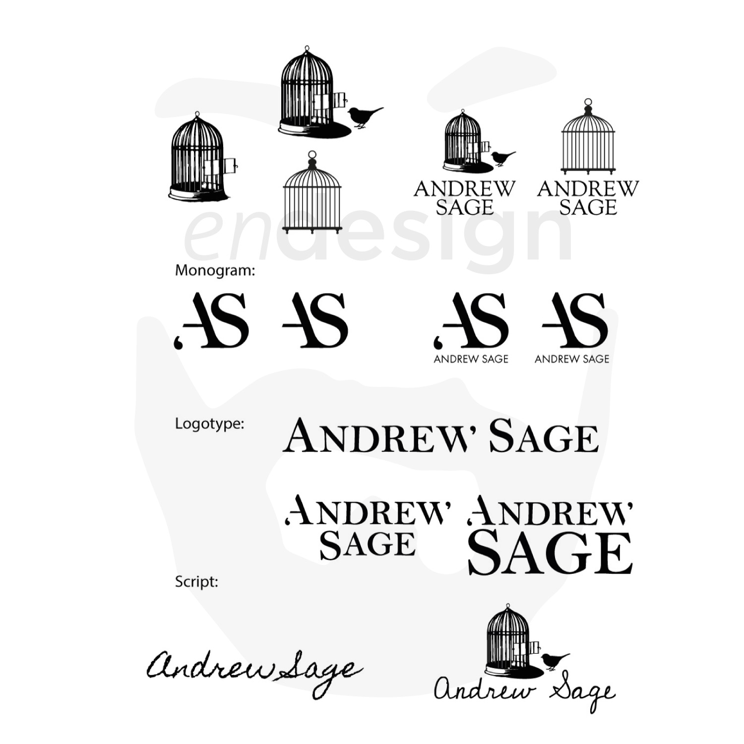
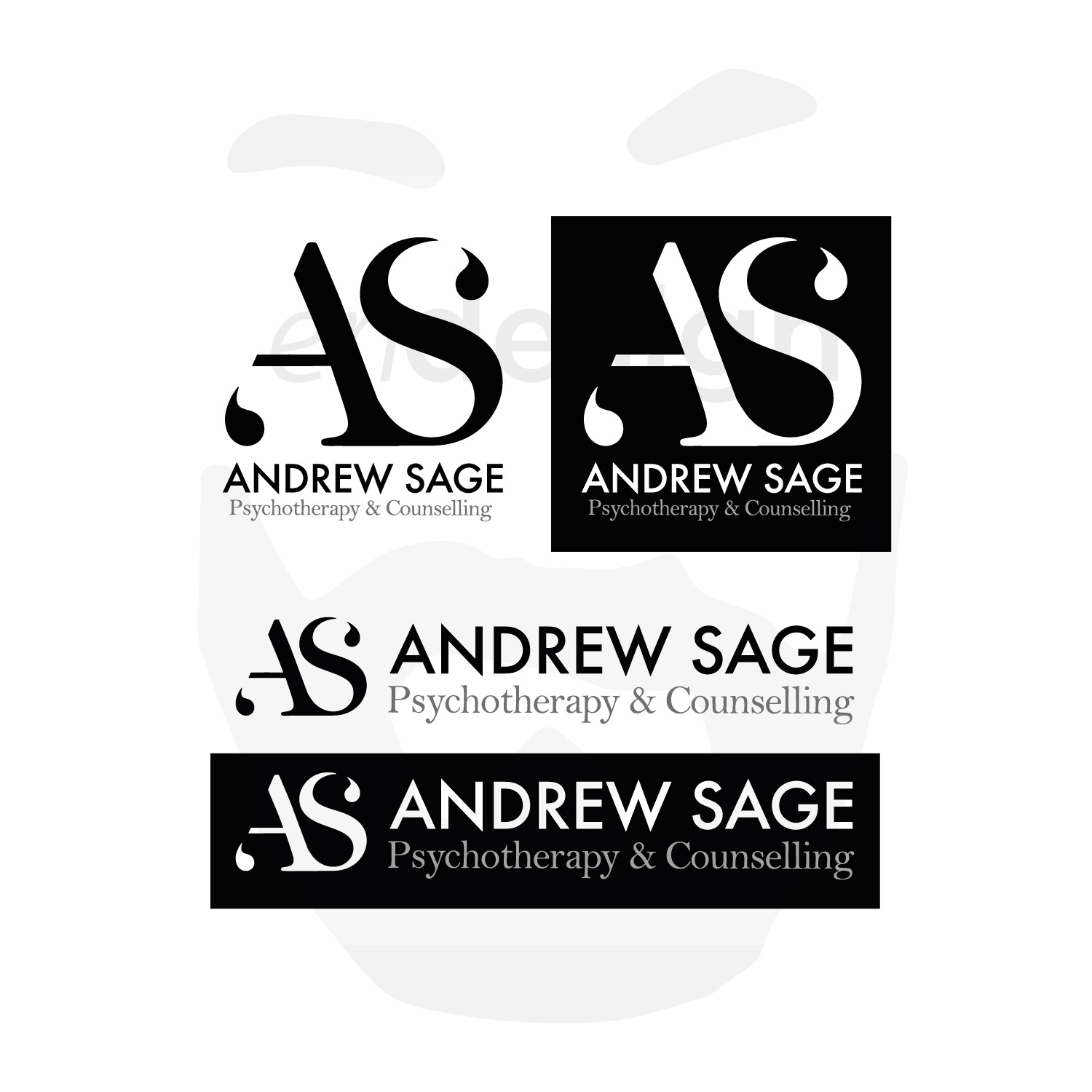
When it came to branding, Andrew sought to emphasize the conversational essence of his therapy sessions. His brand needed to convey growth and development through communication, while also embodying simplicity, strength, and reliability—qualities that resonate deeply with his prospective clients.
The brief was to design a logo that was not only visually striking and bold but also versatile enough to be applied across a range of mediums. This included practical uses such as stickers for paper wraps, takeaway coffee cups, and other packaging, ensuring consistency and recognition at every customer touchpoint. The goal was to craft a design that would resonate with the café’s artisanal roots and reflect the high-quality, personalized coffee experience it offers, while standing out amidst Hackney’s dynamic coffee culture.
In addition to its functional aspects, the branding needed to embody the café’s ethos—celebrating craftsmanship, community, and the love of coffee. The logo was envisioned as a cornerstone of the business’s visual identity, serving as a bold statement of their commitment to quality and creativity.